Giloo — 讓紀錄片不只是「看完就算」
為什麼紀錄片需要不一樣的設計?
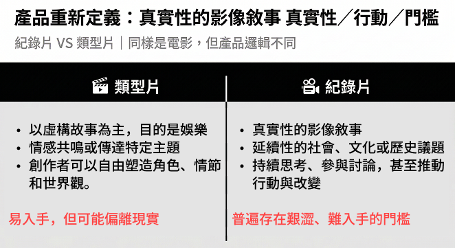
這個問題從一個很基本的觀察開始:同樣是看影片,看完《鐵達尼號》和看完一部揭露政商勾結的紀錄片,觀眾之後的行為是完全不同的。
劇情片的目標是共鳴,紀錄片的目標是理解與討論。然而當時市面上幾乎所有串流平台,都用同一套介面服務這兩種截然不同的需求:選片、按播放、看完、關掉。我們很快就意識到:紀錄片觀眾被現有產品低估了。
從單片出租驗證市場
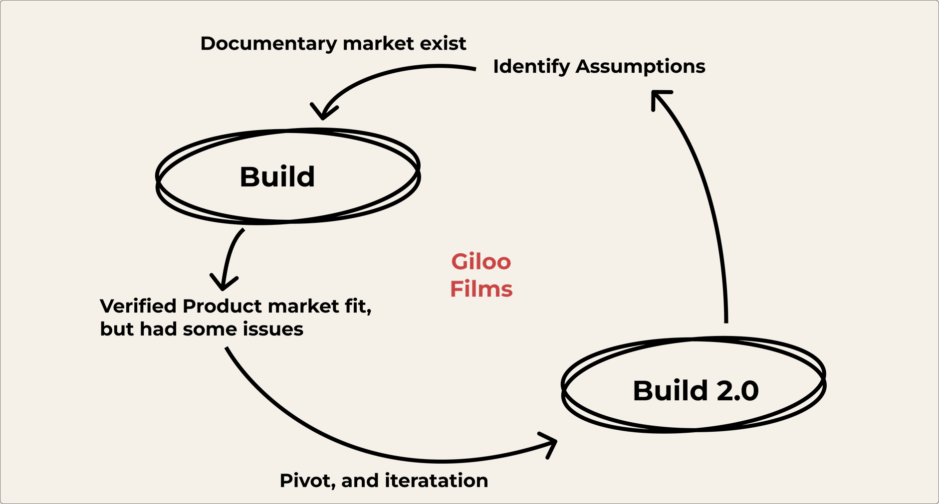
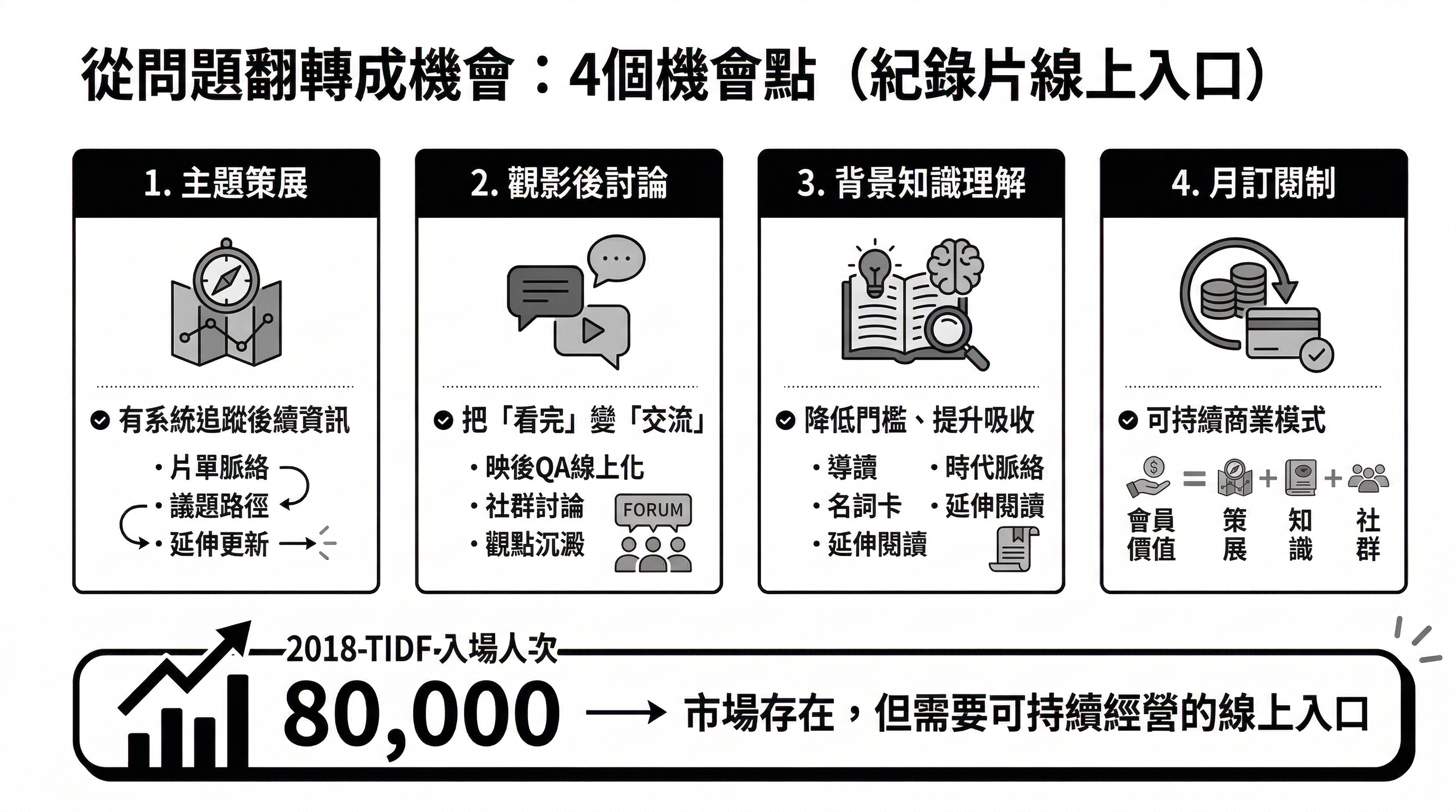
MVP 驗證了市場確實存在,但也揭露了一個根本缺口:觀眾看完之後,既缺乏討論的場域,也沒有工具追蹤事件後續。這些想深入的人,只能自己去 Google、找報導、在 Facebook 發文,然後被演算法吃掉,只有同溫層看見。
從競品研究到產品定位
競品分析:競品仍停留在「賣看片」,競爭最終淪為資本額的比拚
平台 | 定位 | 訂閱模式 | 差異與限制 |
|---|---|---|---|
Netflix(演算法推薦) | 綜合型串流平台 | 月租訂閱 | 內容廣但紀錄片沒有深度策展 |
Catchplay(租借混合制) | 亞洲劇情片為主 | 單片租借+月租 | 不專注紀錄片 |
Topic(最接近的競品) | 社會議題紀錄片 | 月租訂閱 | 無社群功能 |
MUBI(每日一片) | 藝術電影策展 | 月租訂閱 | 策展邏輯不同,社群功能有限 |
各大影展(片量受限) | 實體活動為主 | 票券制 | 時間限制,靠線下活動 |
我們拆解了影展網站、紀錄片典藏庫、以及 Netflix、Prime Video 等主流平台的設計邏輯。發現一個共同盲點:它們都在「賣看的行為」,而不是「賣看完之後的價值」。
影展的策展深度令人羨慕,但不便追蹤後續;串流平台選片方便,但缺乏議題的縱深。沒有一個平台在問:看完之後,我能幫用戶做什麼?
這讓我們確立了 Giloo 的產品定位,不只是播放器,而是紀錄片的知識中站。目標是讓重度紀錄片觀眾,想到「我想深入理解某件事」的時候,第一個想到的是 Giloo。
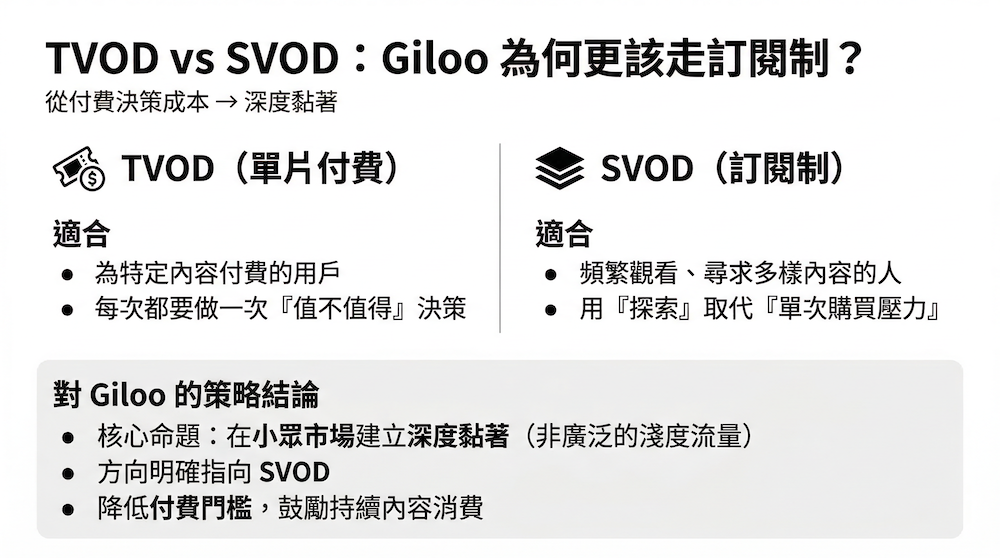
商業模式的選擇:從 TVOD 到 SVOD
為了讓營收能夠成長的目標,我們必須讓片量增加,但同時我們也面臨一個產品策略的關鍵決策:維持 TVOD(單片租借),還是轉型 SVOD(月訂閱)?
Giloo 的機會在於跳脫這個維度,以議題深度與社群連結建立真正的護城河。
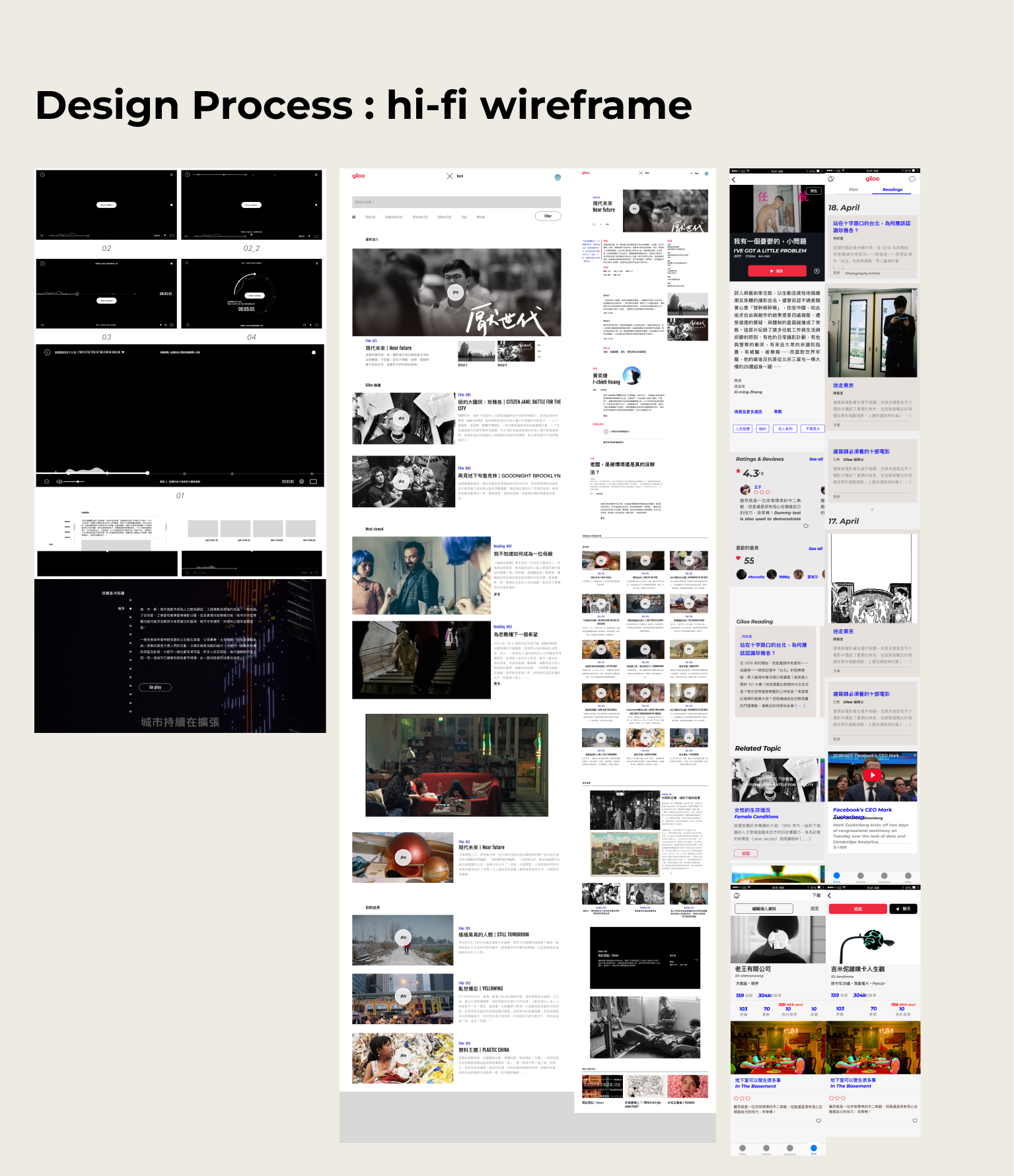
Design Experience
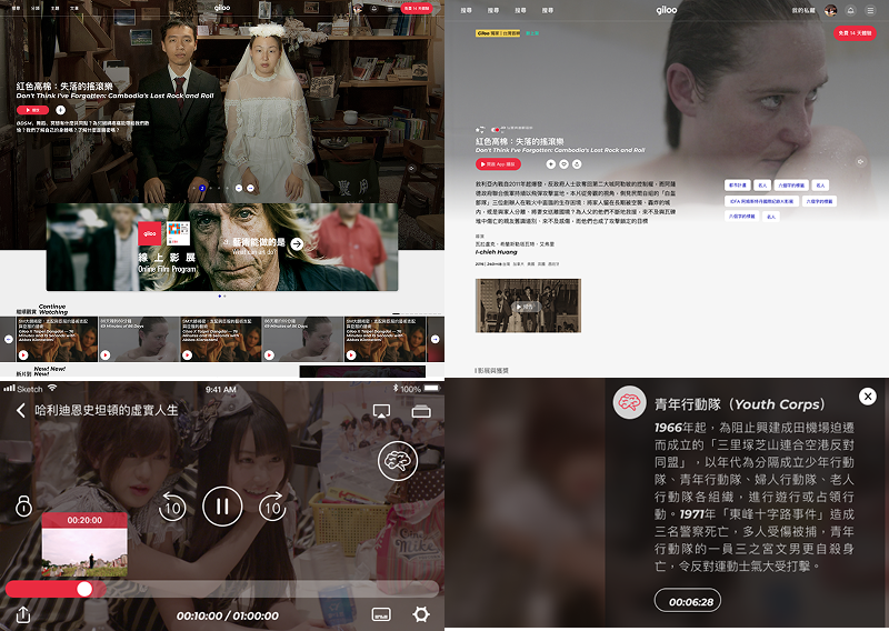
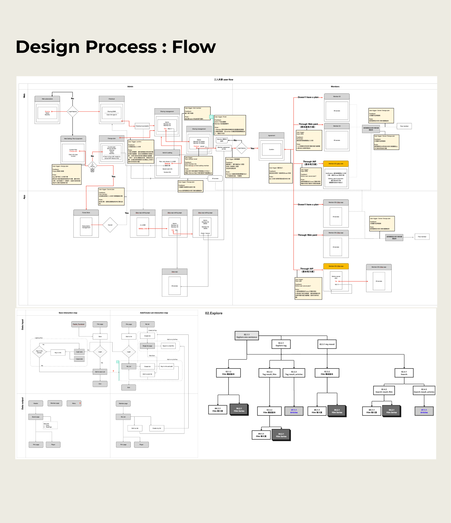
觀影循環設計紀錄片的觀影體驗不是線性的「看完就結束」,而是一個持續循環
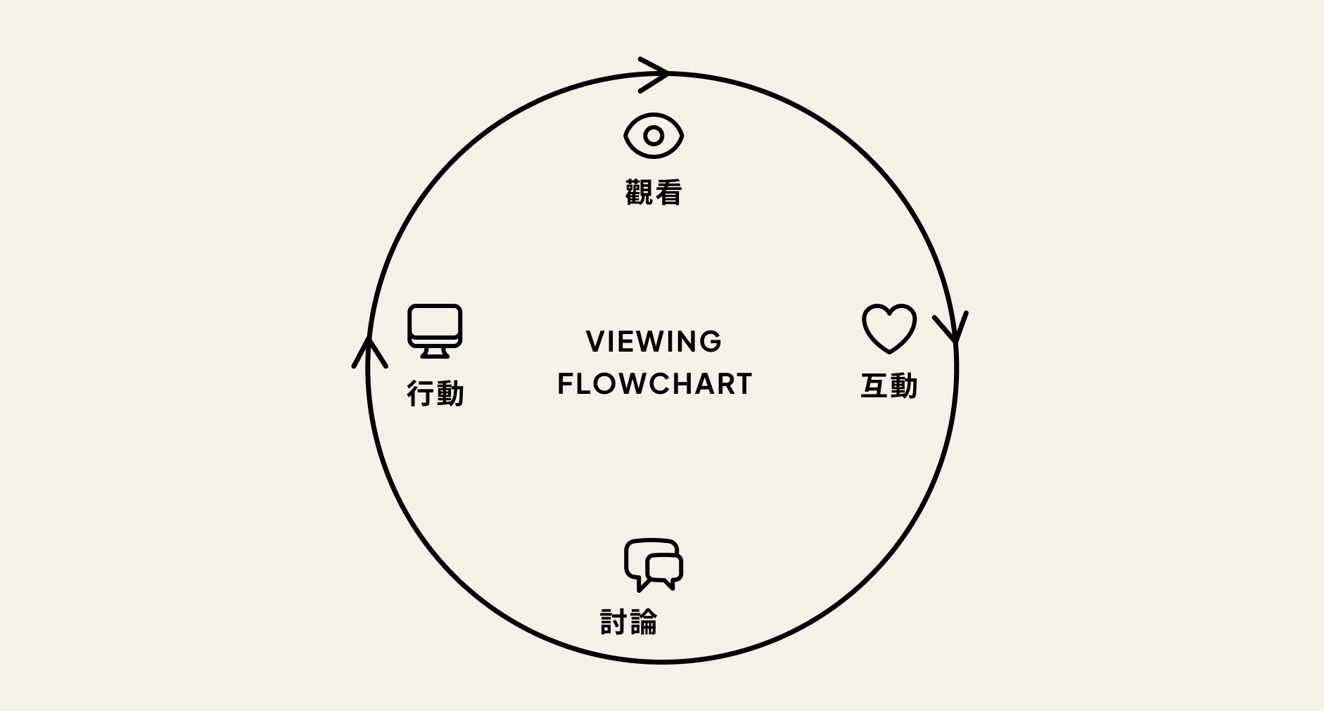
階段 | 使用者行為 | 對應功能 |
|---|---|---|
觀看 | 選片、播放、沉浸式觀影 | 主題片單、Glossary 知識註解 |
互動 | 產生情緒反應、標記重點 | Markers 影片備註、收藏、評分 |
討論 | 與其他觀眾交流觀點 | 會員評論、影評人文章、Q&A |
行動 | 延伸探索、追蹤議題後續 | 主題策展、後續報導、相關片單 |
社群與會員機制
從一個核心問題出發:什麼樣的人願意持續深度參與?
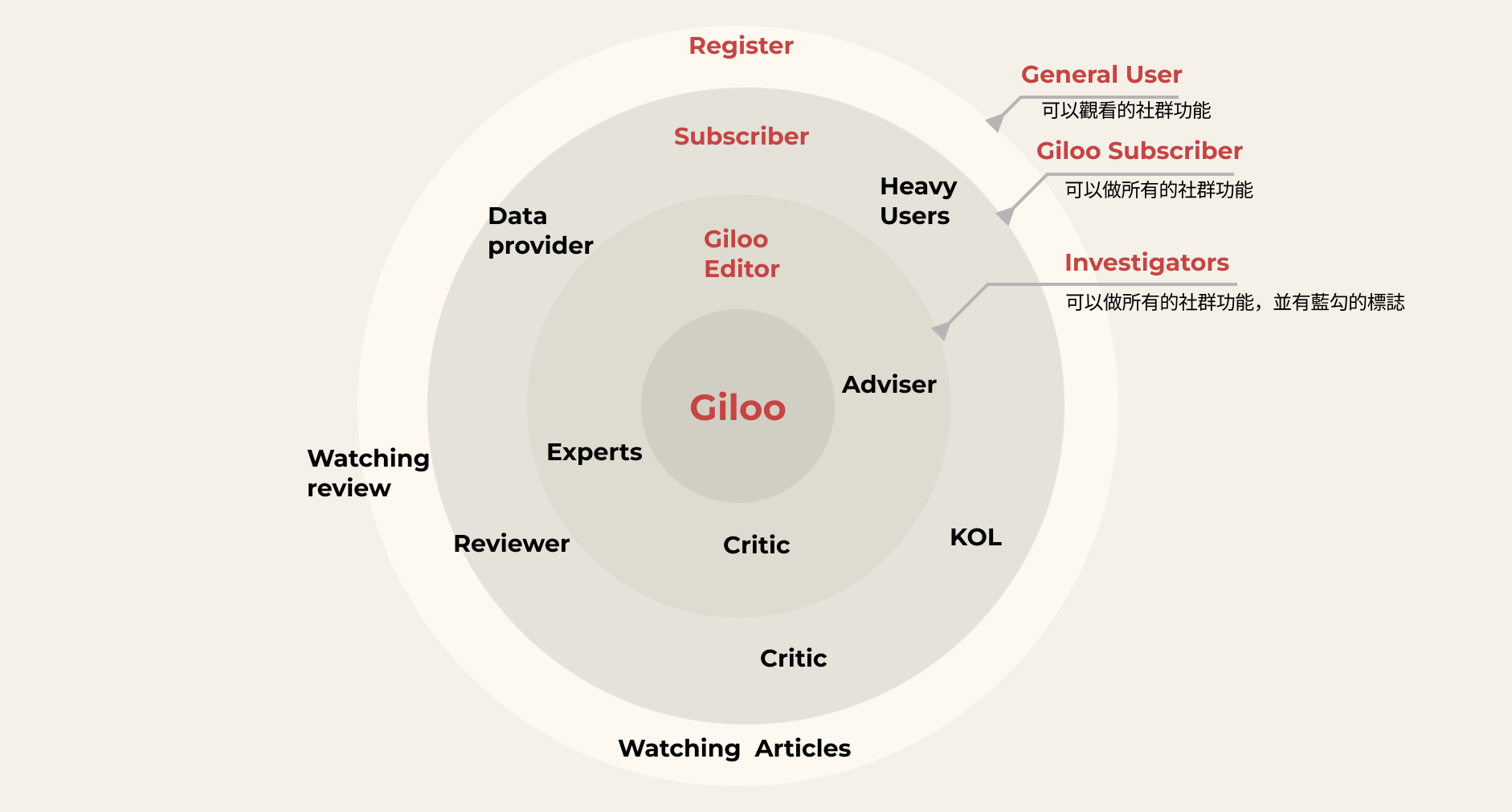
會員層級的設計,本質上是一套行為分類系統,而不只是獎勵機制。我們從觀眾的參與行為出發,定義了三個層級:
層級 | 角色 | 行為 |
|---|---|---|
一般使用者 | General User | 瀏覽、觀影、收藏 |
訂閱會員 | Giloo Subscriber | 評論、收藏、分享 |
內容貢獻者 | Reviewer / Critic / KOL | KOL撰寫影評、文章報導、參與 Q&A |
會員生態系結合三個核心社群功能,打造「看完還想留下來說點什麼」的觀影體驗:
這套生態系結合三個核心社群功能,目標是打造「看完還想留下來說點什麼」的觀影體驗,讓輕度用戶能無壓力參與,讓重度用戶有身份認同與發揮空間,讓專業貢獻者的聲音能被放大。
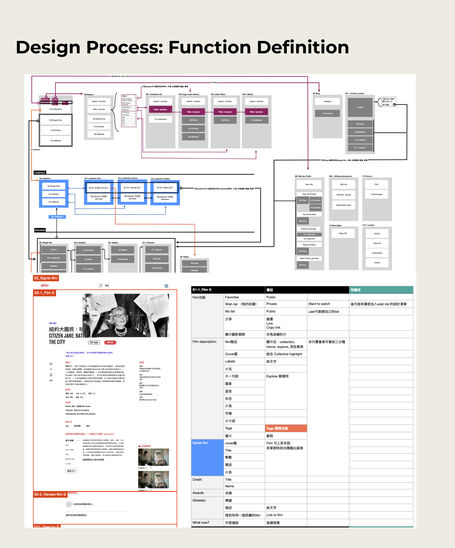
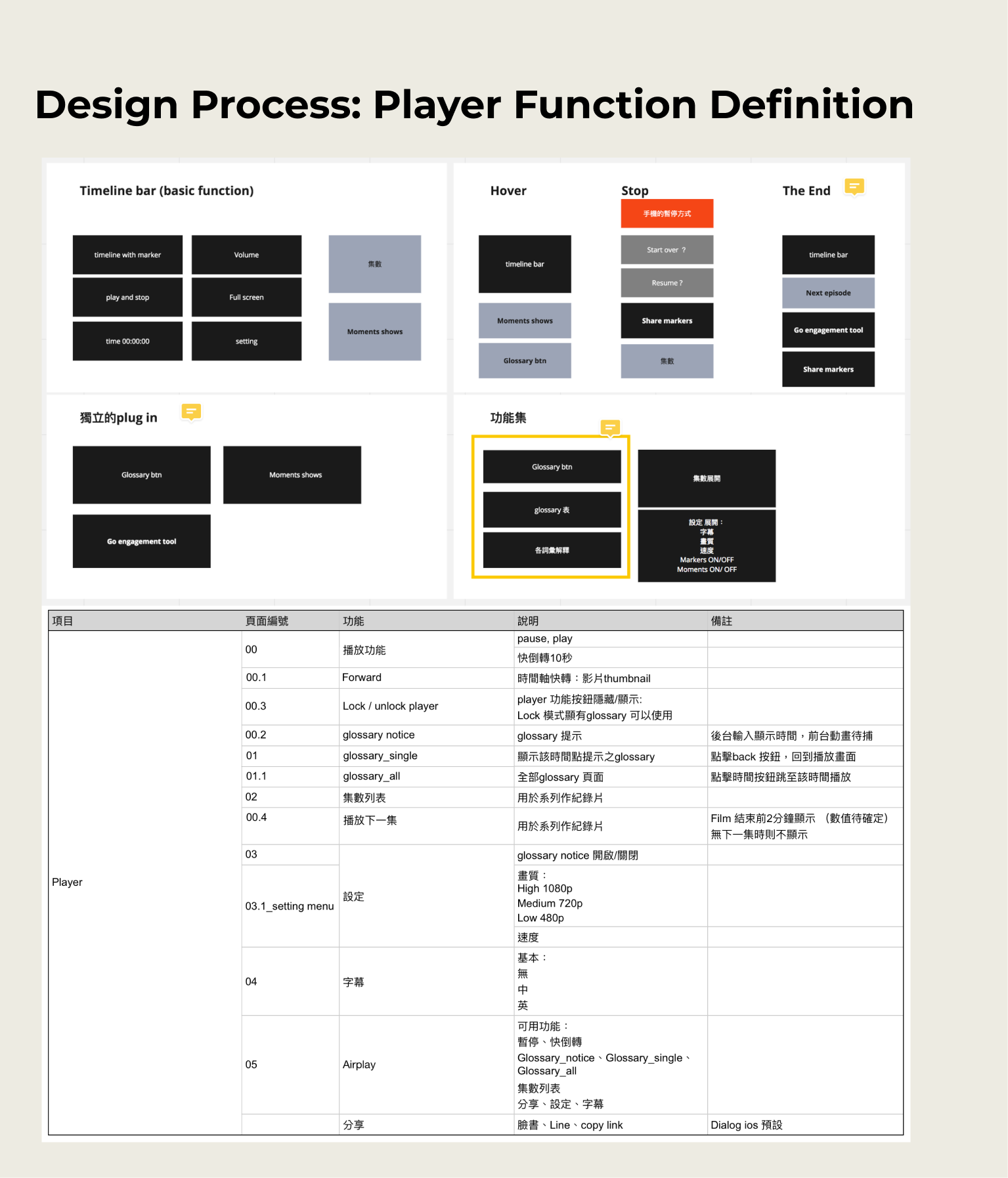
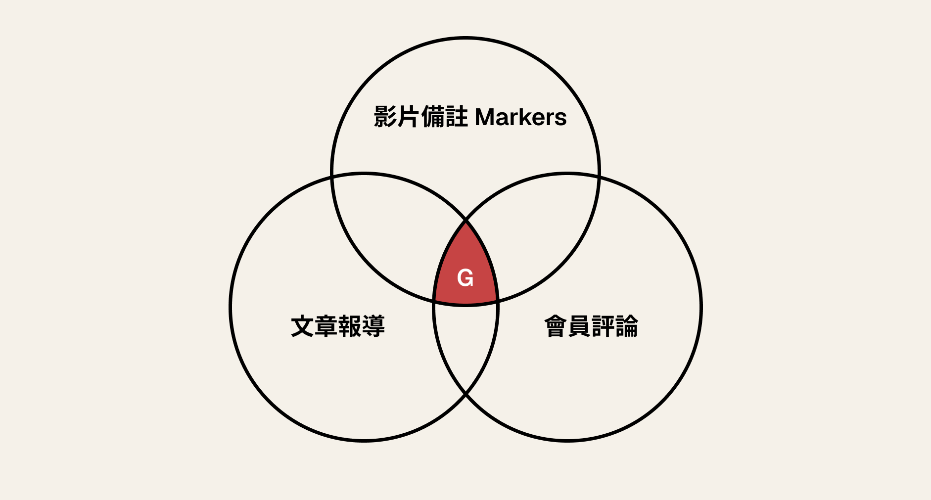
資訊架構:把每一部片拆成最小單位
這是整個產品設計中最核心也最困難的挑戰。
每部紀錄片討論的議題性質不同:有的是歷史事件、有的是社會運動、有的是人物傳記。如果每部片都用同一套模板,內容會失去意義;如果每部片都客製化,系統無法擴展。
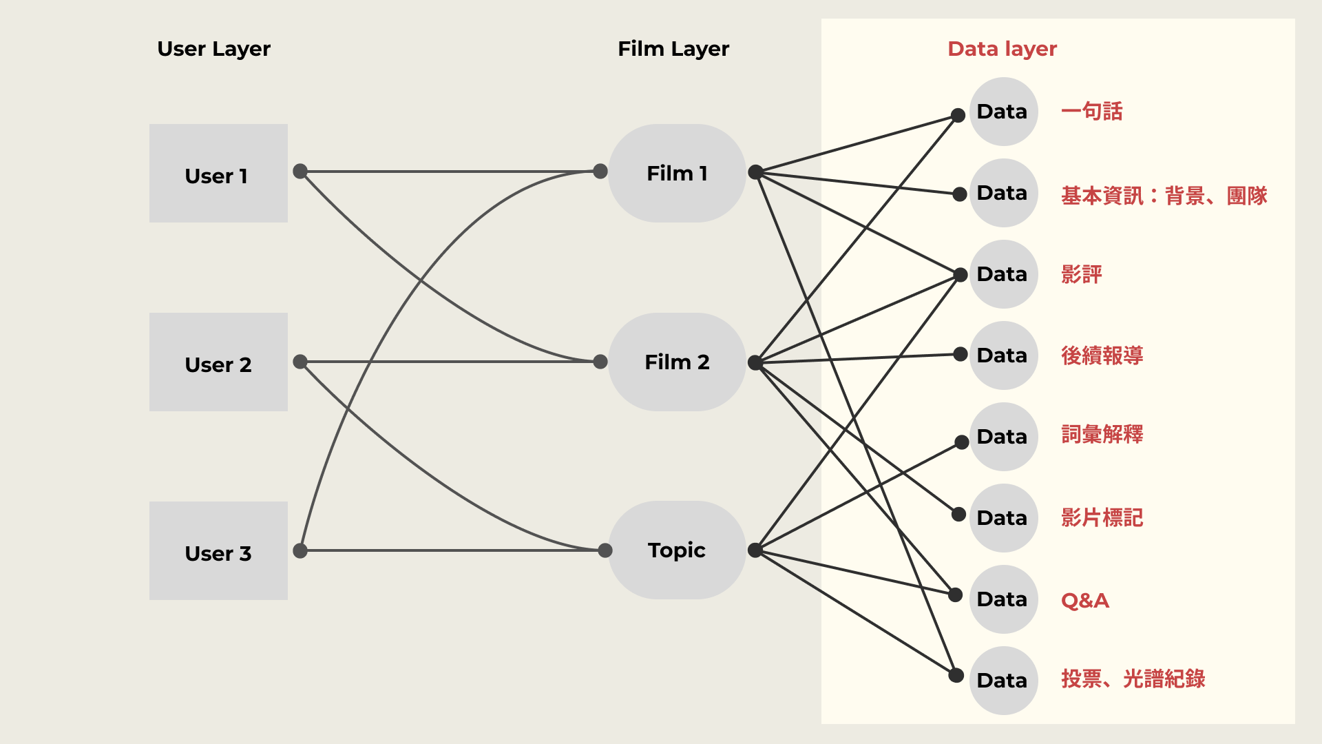
我們的解法是:把所有資訊拆解成最小的 metadata 單元,再依每部片的需求組合。 這些元數據包括:一句話簡介、基本背景與團隊、影評、後續報導、詞彙解釋、影片標記、Q&A、以及投票與光譜紀錄。每部片可以選用不同的組合,但底層的資料結構是統一的。這讓平台既有彈性,又能在不同片之間形成可比較、可關聯的知識網絡。
功能如何長出來:從觀影行為反推設計(JBTD : Job To Be Done)
功能設計的起點,是觀察用戶看完片之後實際會做什麼事。
我們發現觀眾有幾個高頻行為:想查某個人名或專有名詞、想知道這件事後來怎麼了、想知道別人對這部片的看法、想留下自己當下的感受。每一個行為,都是一個設計機會。
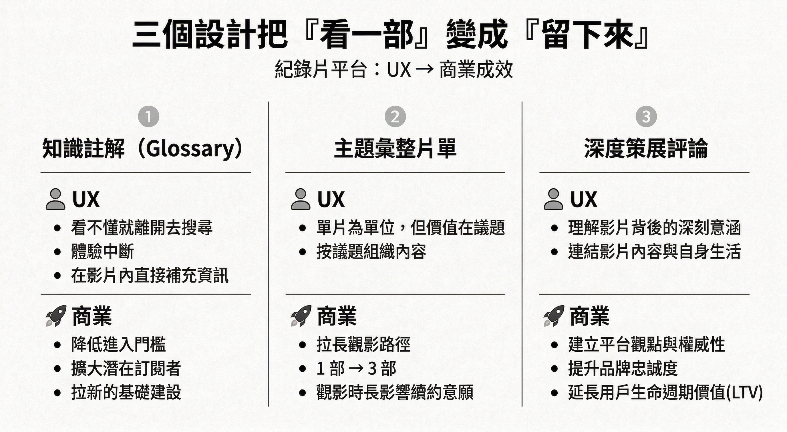
Glossary(冷知識) 最先上線,解決「查詞會打斷觀影」的問題——觀眾可以在不離開播放器的情況下,直接查看詞彙解釋。上線後反應超乎預期,深受觀眾喜愛,也驗證了「降低理解門檻」這個設計假設。
Topic Collection 解決了「同主題的片怎麼找」的問題,類似線上策展的概念,讓相關議題的影片能被有系統地集結,而不是散落在演算法推薦裡。
深度影評(Rating & Review)表達觀影者的感受,並藉由其他觀影者的回饋,找到抒發的管道。
影片標記(Markers) 來自用戶回饋:觀眾想在特定時間點記錄當下心情,也想看看別人在同一個片段有什麼反應。這個功能讓觀影從私人體驗,部分變成了共同體驗。
Outcome
訂閱影片觀賞 = 訂閱議題與知識 = giloo 2.0
從一個「放紀錄片的地方」,重新定義為「影迷與知識影像的文化社群」。
交付內容:
- Glossary 獲得好評
- iOS App 編輯精選
Key Insight
- UX 解決的是體驗斷點,但每一個體驗斷點的背後,都是一個商業漏損。
- 紀錄片的價值在議題不在單片。以 Topic 為中心,讓內容之間產生關聯。
設計的個人挑戰
這也是我第一次做完整的 App 設計。雙系統(iOS / Android)的 guideline 差異,讓我深刻理解到:設計規範不是限制,而是讓不同平台上的用戶都能在熟悉的環境中找到直覺。如何在兩套系統的差異中取得平衡,是這個案子給我最扎實的一堂課。
Showcase