CyberPoker — 從一張牌桌,重新定義行動撲克的樣子
一切從一個問題開始
接下這個案子的時候,我問了自己一個問題:一款真正好玩的手機撲克,應該長什麼樣子?
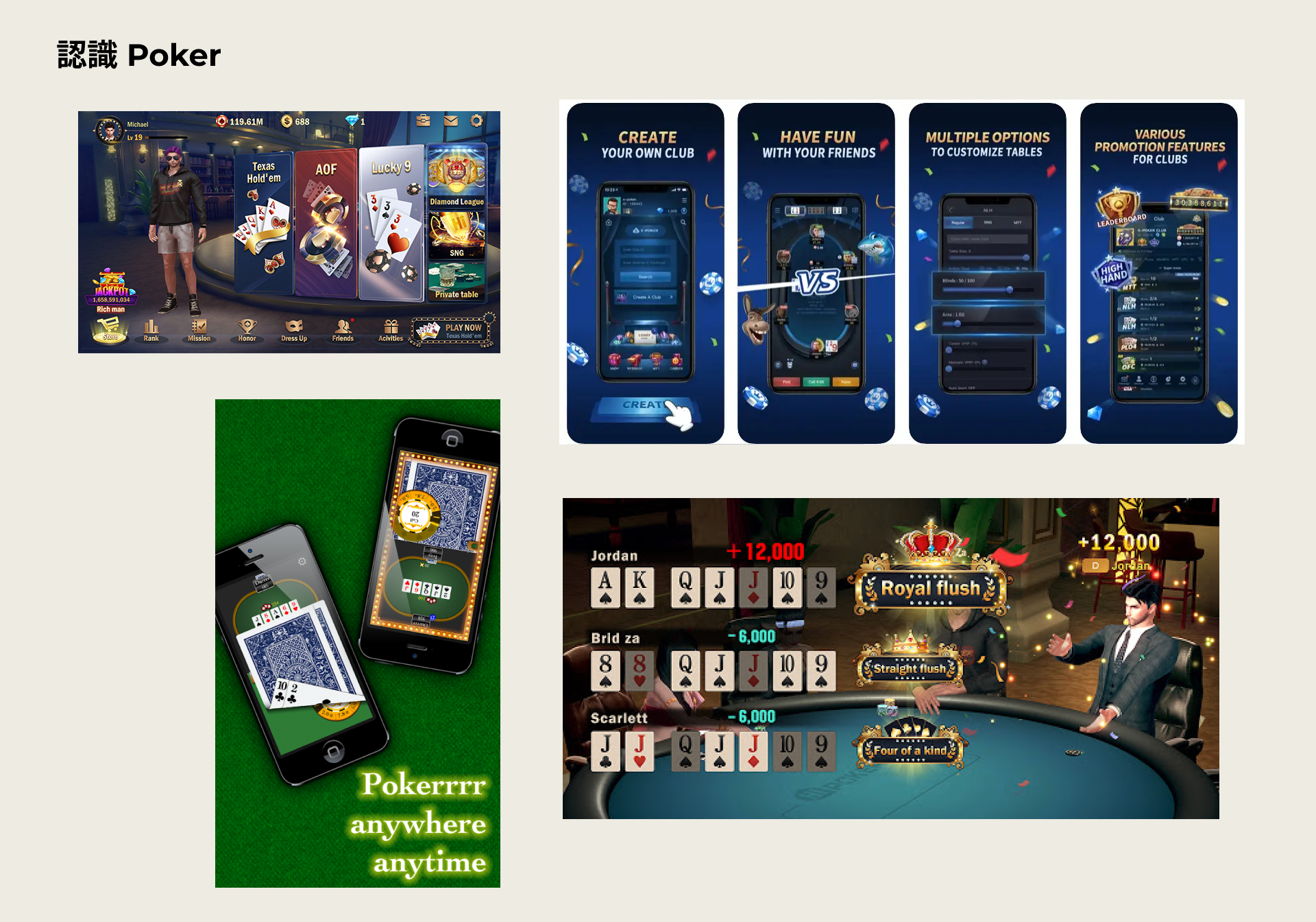
市面上的競品都有各自的答案。Hi Poker 把社交放第一,介面輕鬆適合新手;Poker X 主打競技,受資深玩家青睞;Pokerrr 則讓私人牌局變得更靈活。但這些產品有一個共同點——它們都把自己定位在一個已知的框架裡,把功能堆上去,然後等玩家上門。
我們想做的,是在框架之外找一個位置。
先把地基蓋好:理解產品,理解玩家
開始動手之前,我們先花時間做了兩件事。
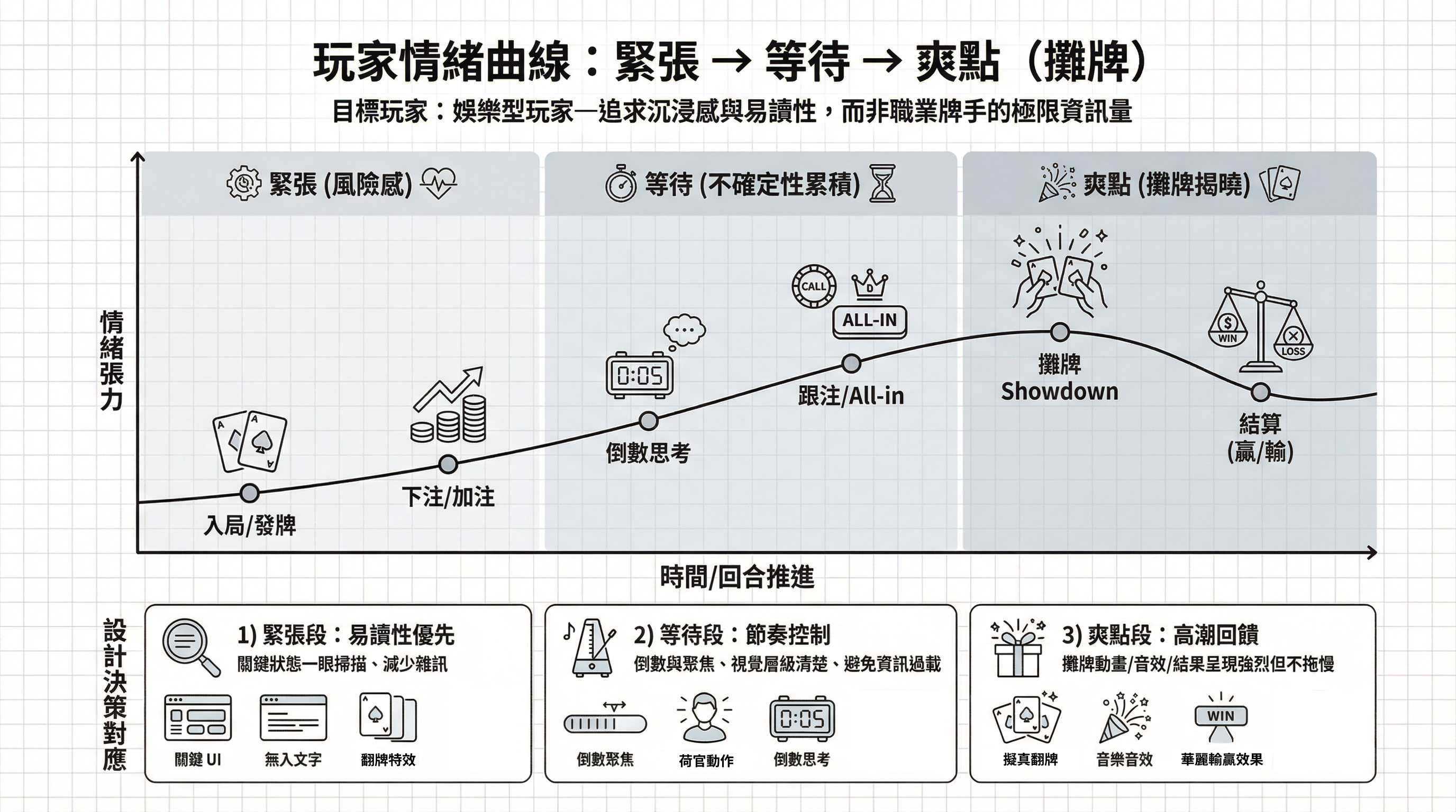
第一是真正學會玩撲克。規則層面的學習很快,難的是理解玩家的心智模型,他們在什麼時機緊張、什麼時機亢奮、哪一個動作讓他們覺得「爽」。這個過程讓我意識到,撲克的魅力不在牌面,在那個充滿不確定性的等待。
第二是定義我們的玩家是誰。我們把目標鎖定在娛樂型玩家:不是職業牌手,而是那些想從日常抽離、想在虛擬桌上感受一點刺激的人。這個決定決定了後來幾乎所有的設計取捨,3D 場景的選擇、角色化的設計方向、下注操作的重新設計,全都圍繞著「沉浸感」和「易讀性」兩個核心展開。
把「好玩」設計成一個系統
我們想要玩家不只是玩一次,而是一再回來。
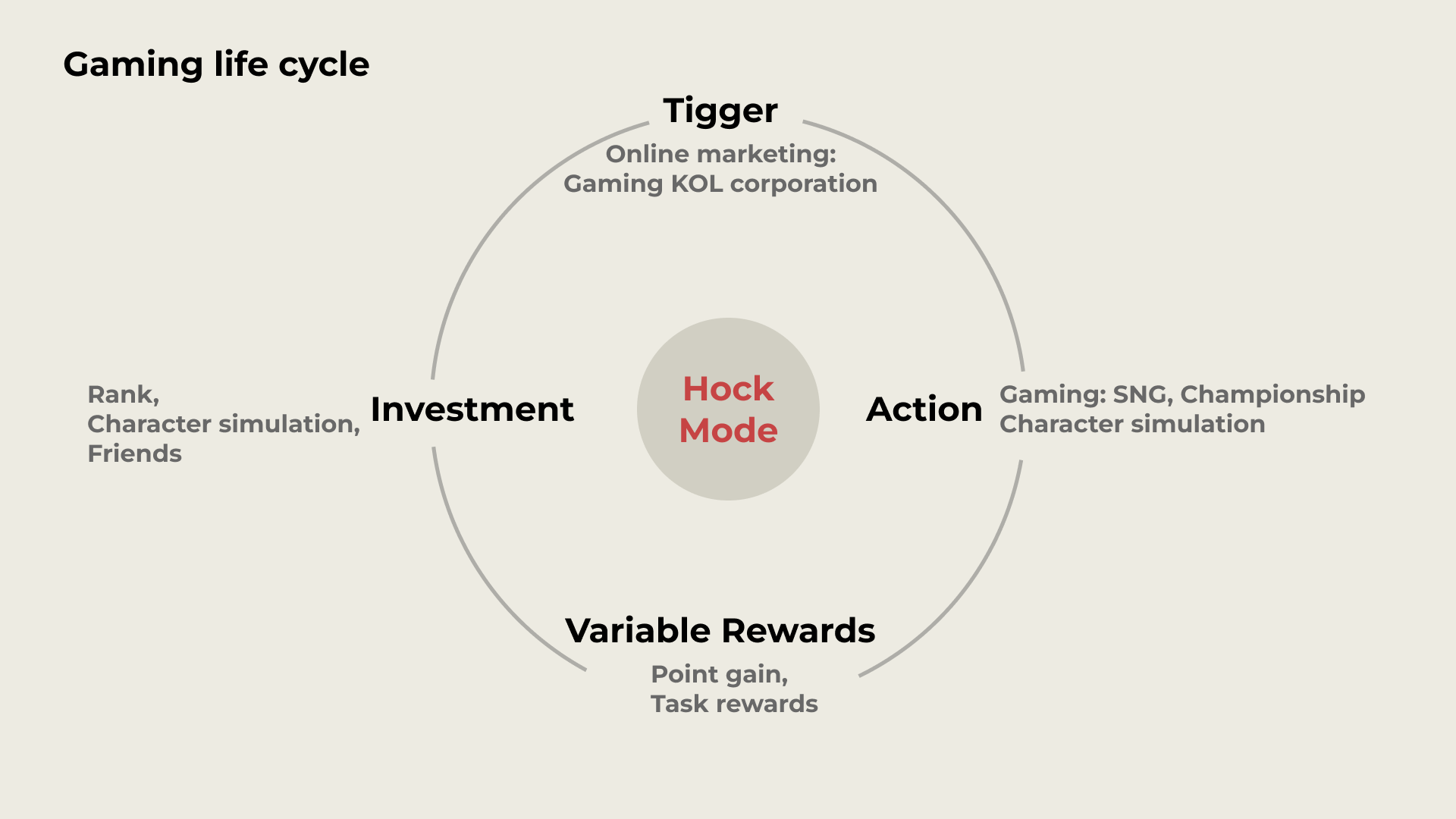
我們借鑒了 Nir Eyal 的「鉤隱效應」,把整個遊戲生命週期拆成四個環節來思考:
如何讓人第一次注意到這款遊戲(觸發)、如何讓他們打開之後真的玩下去(行動)、如何讓每一局都留有意外驚喜(變動性獎勵)、以及如何讓他們在遊戲裡留下屬於自己的痕跡,讓離開變得有點捨不得(投資)。
這個框架讓我們在設計具體功能的時候多了一個維度,不只問「這個功能好不好用」,也問「這個功能在整個遊戲旅程裡,扮演的是什麼角色」。
開發:讓想法變得具體
進入開發階段後,溝通成了最大的挑戰。
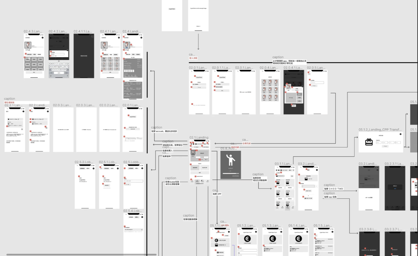
我們面對的不只是設計師和工程師,還有 3D 美術、遊戲邏輯開發、還有客戶端。每個人對「最終產品」的想像都略有不同。為了對齊這些想像,我選擇用 Wireflow 加上 Storyboard 的方式來溝通——不是把線框圖和流程圖分開放,而是把「每一個畫面在玩家操作後會發生什麼」畫成一條連貫的故事線。
這個決定省下了大量來回確認的時間,也讓 3D 美術團隊在還沒看到實際介面的時候,就已經能夠理解場景需要呈現的氛圍和節奏。
開發流程採用 Scrum,以衝刺週期推進。每個增量完成後立刻測試、取得回饋、再修正。這種方式讓我們不需要等到「完成」才發現問題。
最難設計的,往往是最小的那個細節
整個專案裡,有一個設計問題讓我花了最多時間:下注轉盤。
現有的手機撲克幾乎都用滑動條來控制下注金額。但在實際觀察玩家操作之後,我發現這個設計有個根本性的問題——單手握持手機的時候,拇指的活動範圍很有限,滑動條容易滑過頭,也容易在猶豫的時候反覆來回,拖慢決策節奏。
我們做了兩到三個版本的探索,從資訊量較多的設計一路精簡,最後確定了一個以「分段選擇」為核心的互動邏輯。從 Mockup 到 Prototype,在 Figma 裡做出來讓測試者實際體驗,每一輪都有明確的問題和指標,修改有所依據。
這個過程讓我更清楚地認識到一件事:「簡單」不是設計的起點,而是設計的終點。
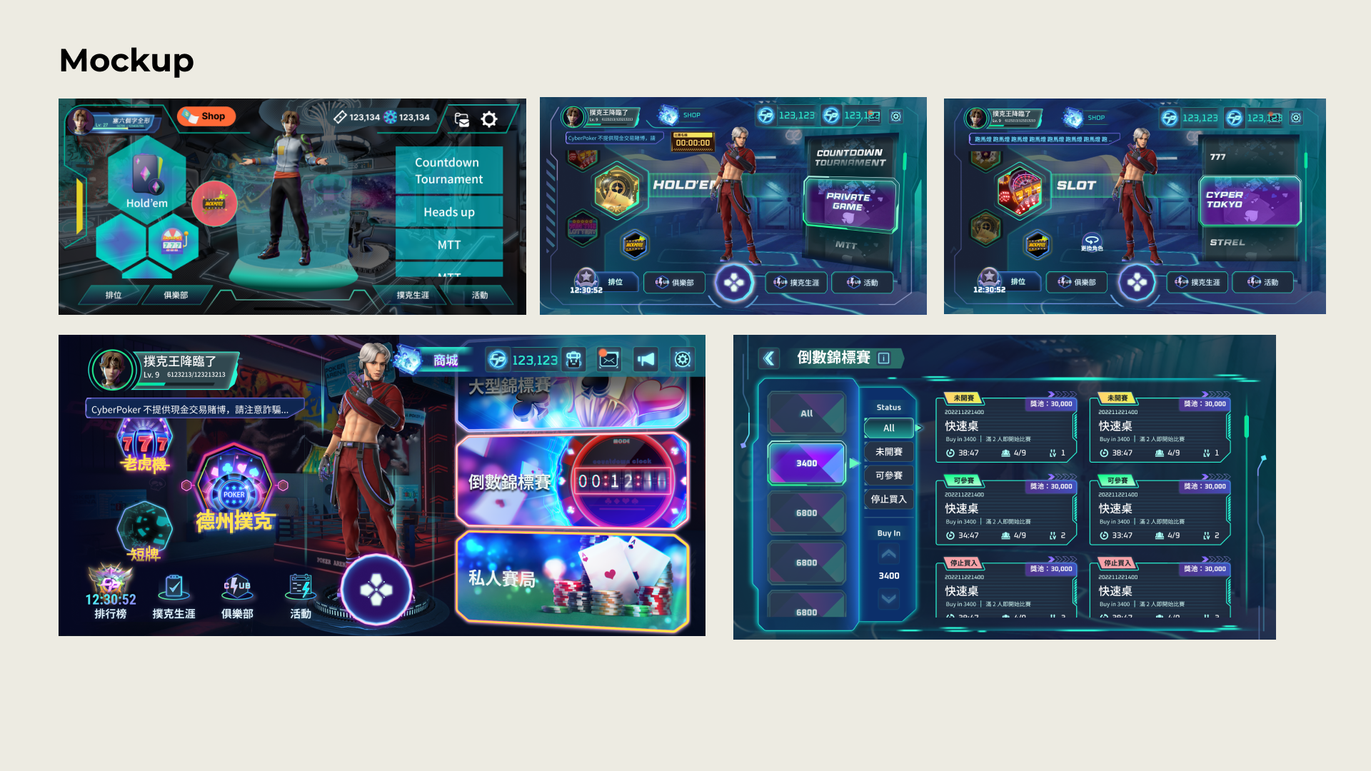
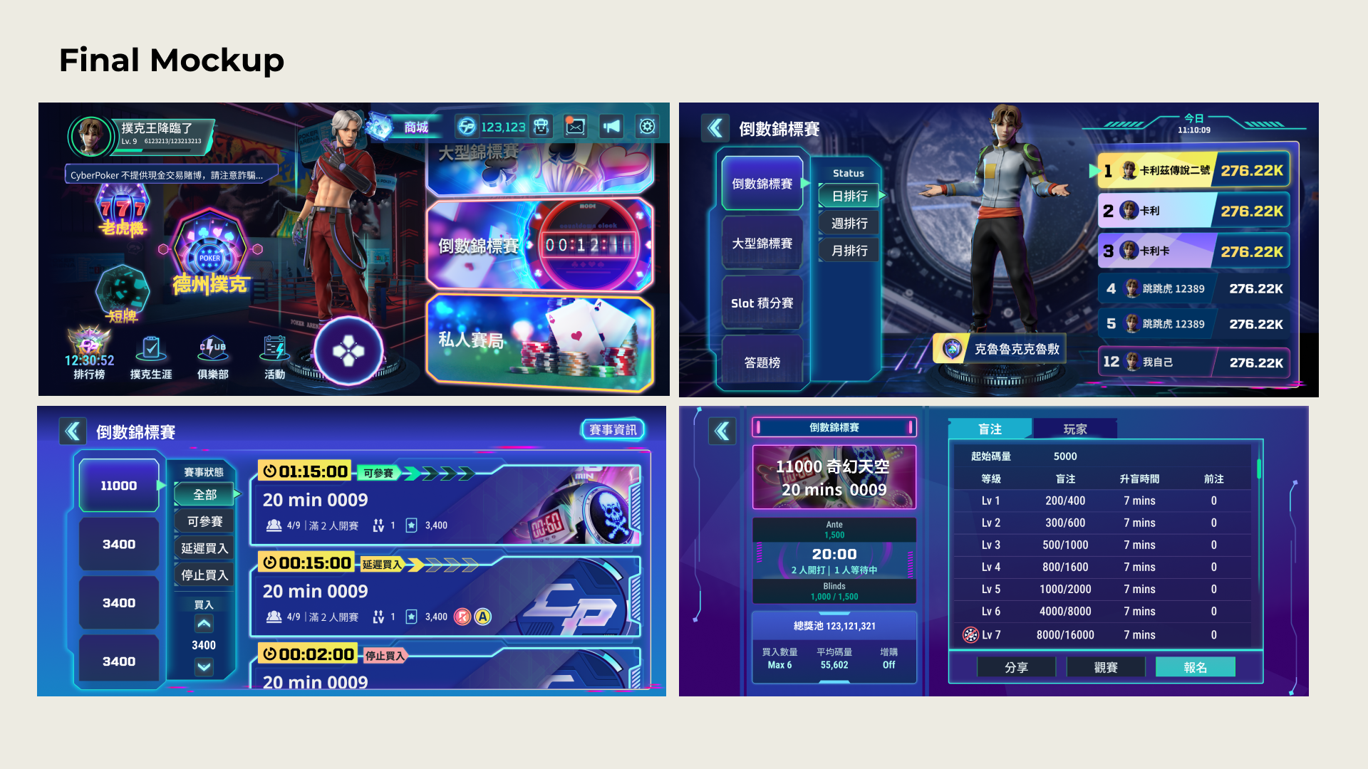
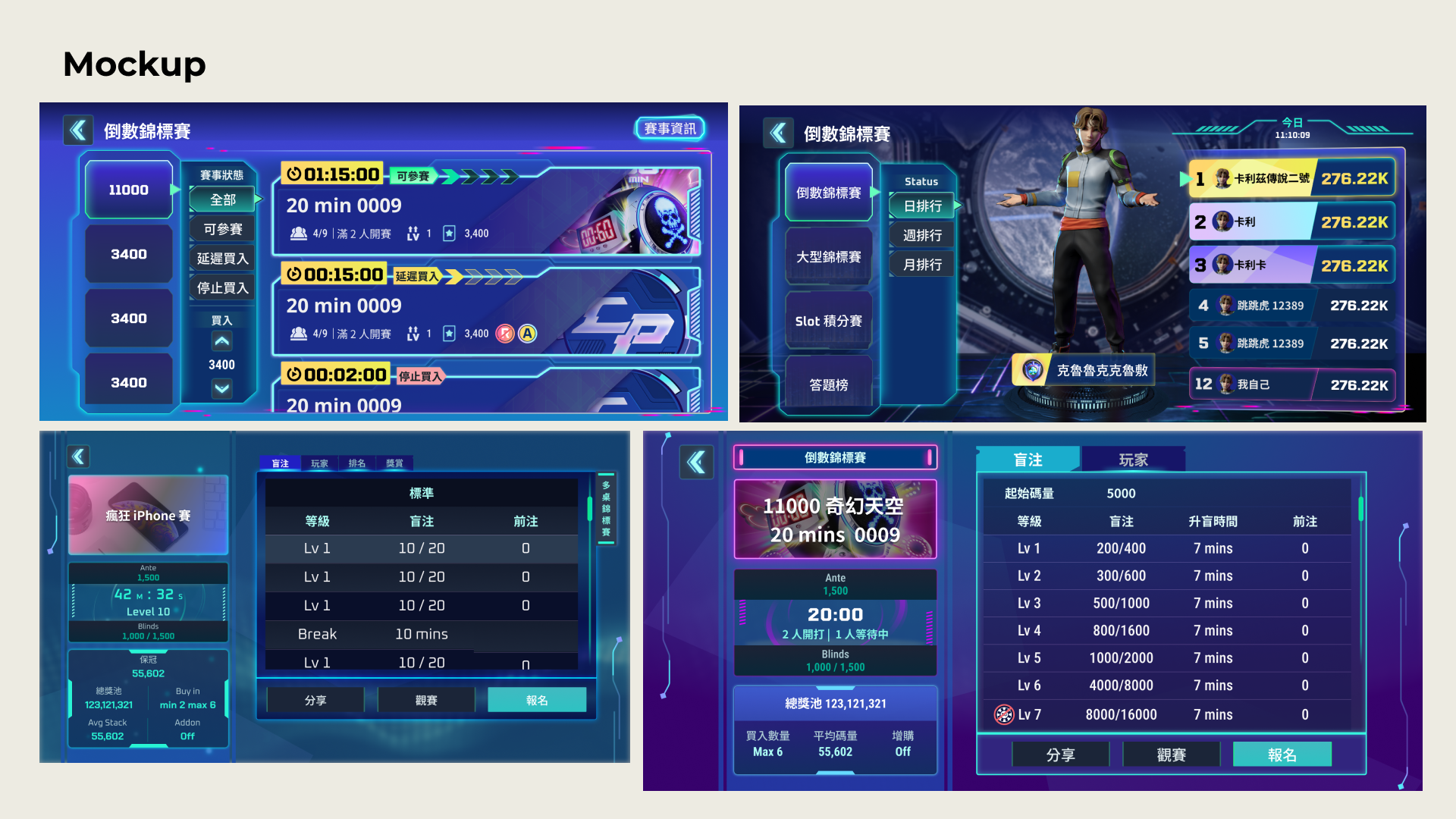
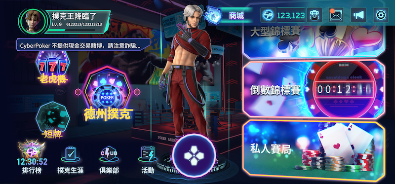
公測之前,改了三遍的牌桌
遊戲畫面的簡化是另一場持久戰。
3D 場景提供了豐富的視覺層次,但同時也帶來了大量需要被控制的資訊。牌桌上有籌碼、牌面、玩家頭像、計時器、操作按鈕——每一個元素都有存在的理由,但放在一起,畫面就開始說話太多。
公測版上線前,牌桌介面前後改了兩到三版。每一版都有測試、都有問題回收、都有根據數據做的取捨。最後的版本不是「最美」的,而是「在對的時機讓玩家看到對的資訊」的那一個。
回頭看這段路
CyberPoker 對我來說不只是一個專案,而是一次真實的考驗——在客戶需求、技術限制、使用者體驗三者之間找到平衡,在不確定性裡持續做出有依據的判斷。
每一個設計決策背後,都有一個「為什麼」。而能說清楚這個「為什麼」,才是我認為身為產品設計師最核心的能力。
Showroom