Stretch Design — Cross-Border E-Commerce Redesign
Starting Point: A Stretchable Chair and an Untold Story
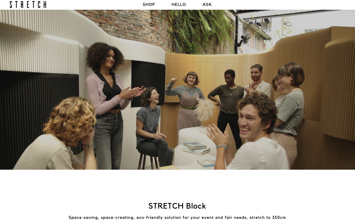
Stretch Design's predecessor was FlexibleLove, whose most iconic product is a folding chair made of paper honeycomb structure — stretchable and shapeable to any space, transforming from a two-seater to a ten-person bench. The concept itself is like magic, but making people believe in magic requires more than just a product — it needs a clear story.
In 2015, Stretch Design officially entered e-commerce, selling to global consumers. After the first website launched, order numbers didn't meet expectations. The problem wasn't the product — the website didn't give people the confidence to buy.
Where the Problems Were: Three Reasons Consumers Stopped
When I joined the project, my first step was to integrate customer service reports with Google Analytics behavioral data, trying to find the real reasons for low conversion rates. We identified three core barriers:
1. "It's made of paper?": Material Trust Issues For most consumers, 'paper furniture' immediately triggers doubt: Is it durable? Can it bear weight? What about rain? The product page didn't directly address these concerns, so consumers filled in the blanks themselves — and left.
2. "How much is shipping?": Hidden Anxiety in Cross-Border Purchases For cross-border e-commerce consumers, shipping cost is a critical decision variable before checkout. But in the first version, shipping information was neither prominent nor real-time — consumers had to reach the checkout page to find out, and this 'surprise' often led to cart abandonment.
3. "I can't understand it.": Information Overload for Non-Native English Speakers According to customer data, most of Stretch Design's buyers were non-native English speakers. Dense text descriptions in this context weren't helpful — they were barriers.
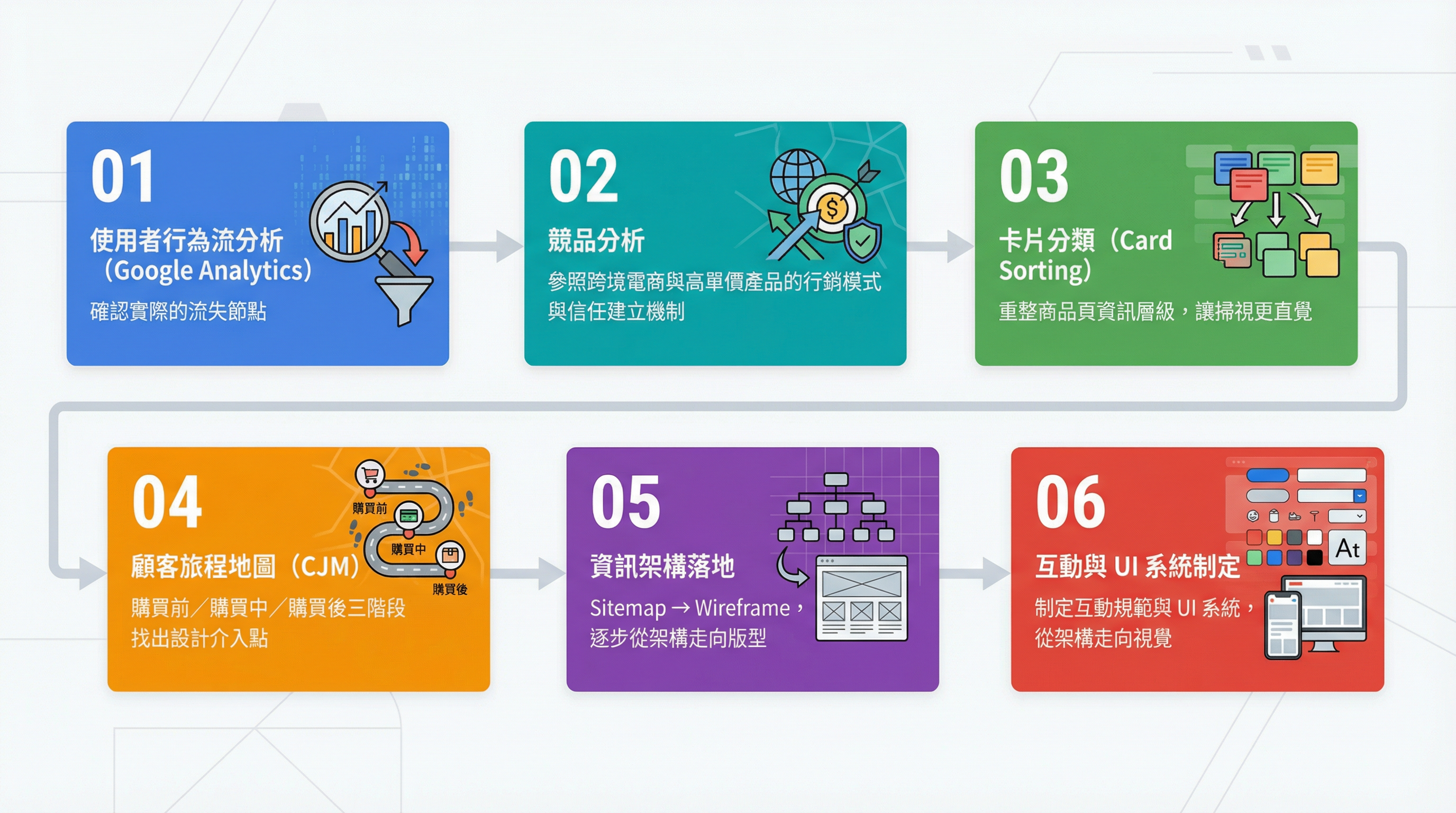
Design Decisions: Working Backwards from the User's Purchase Journey
After confirming the problems, I adopted a UCD (User-Centered Design) process, with the core method being working backwards — first asking 'what do consumers care most about after buying,' then working backwards to 'where in the journey did we fail to provide the information they needed.'
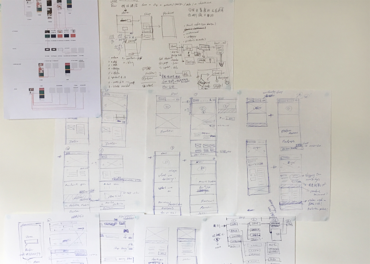
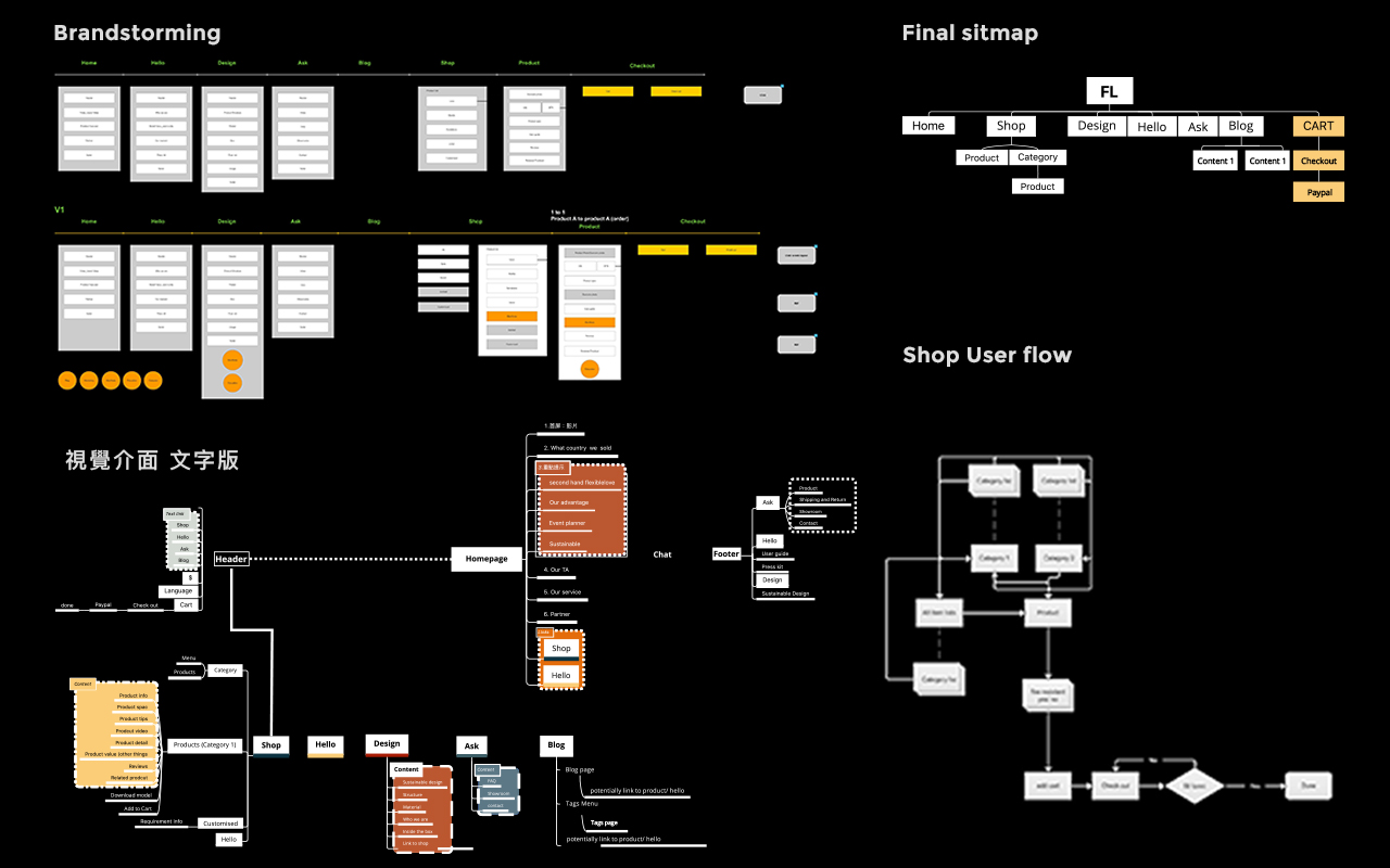
The process was divided into several phases:
Solution: Giving Every Concern a Clear Answer
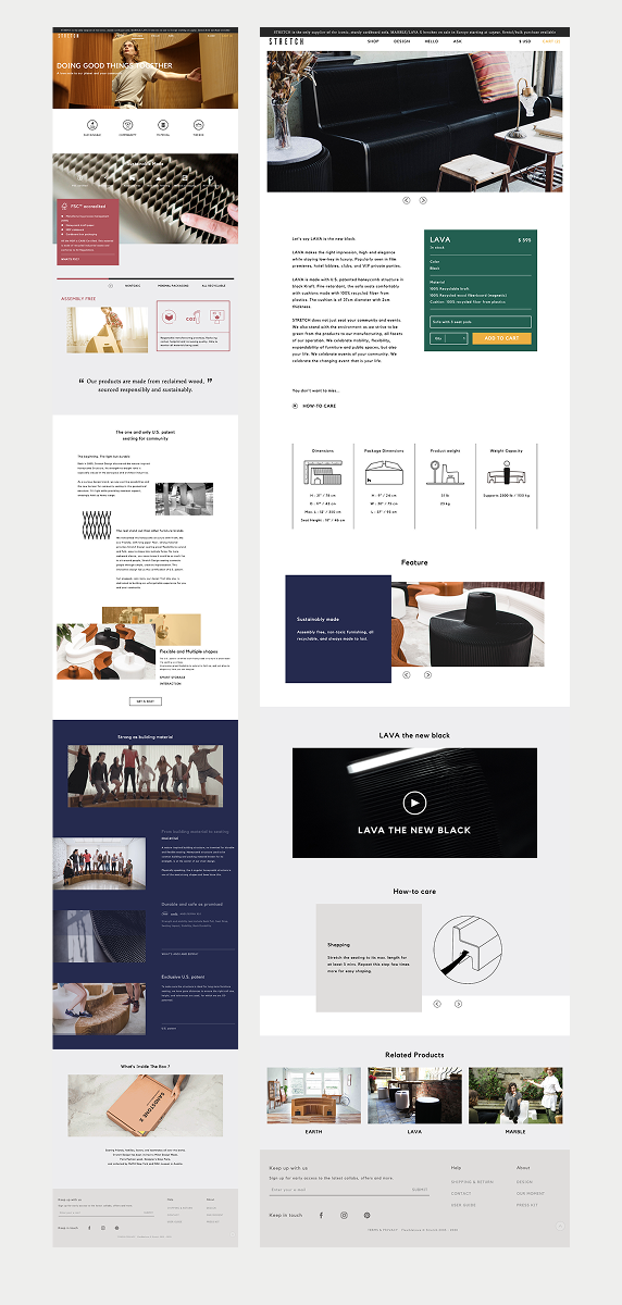
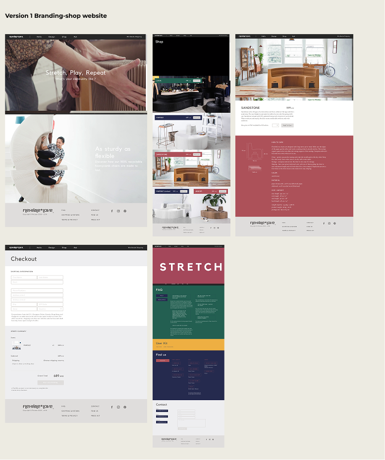
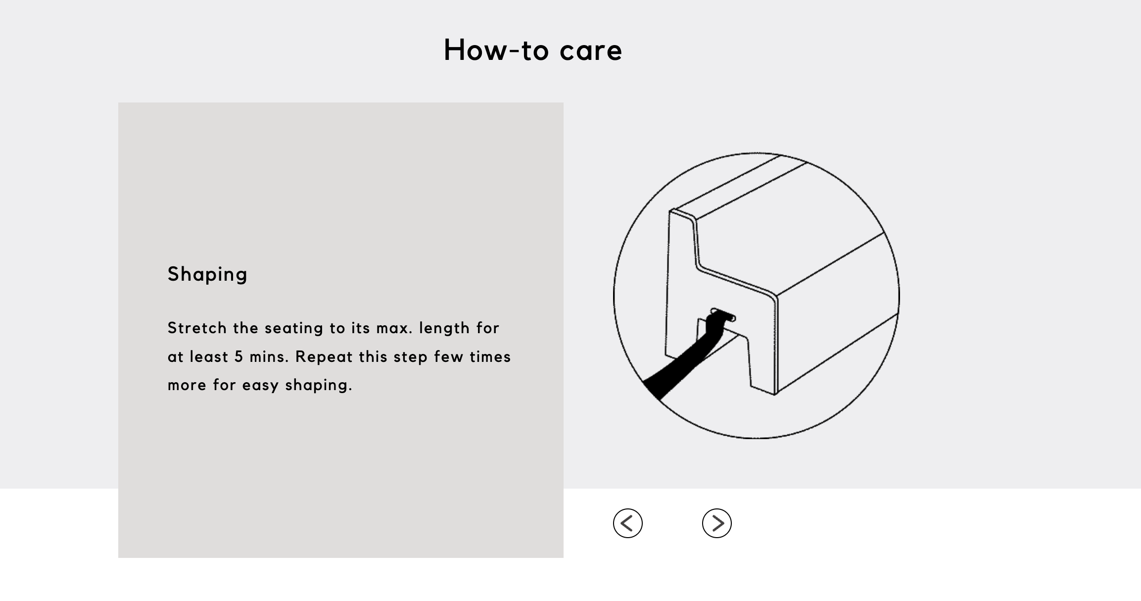
For material trust: we built a dedicated material explanation section in product pages, directly and specifically explaining honeycomb paper structure's load-bearing data, durability, and care methods, supported by contextual imagery.
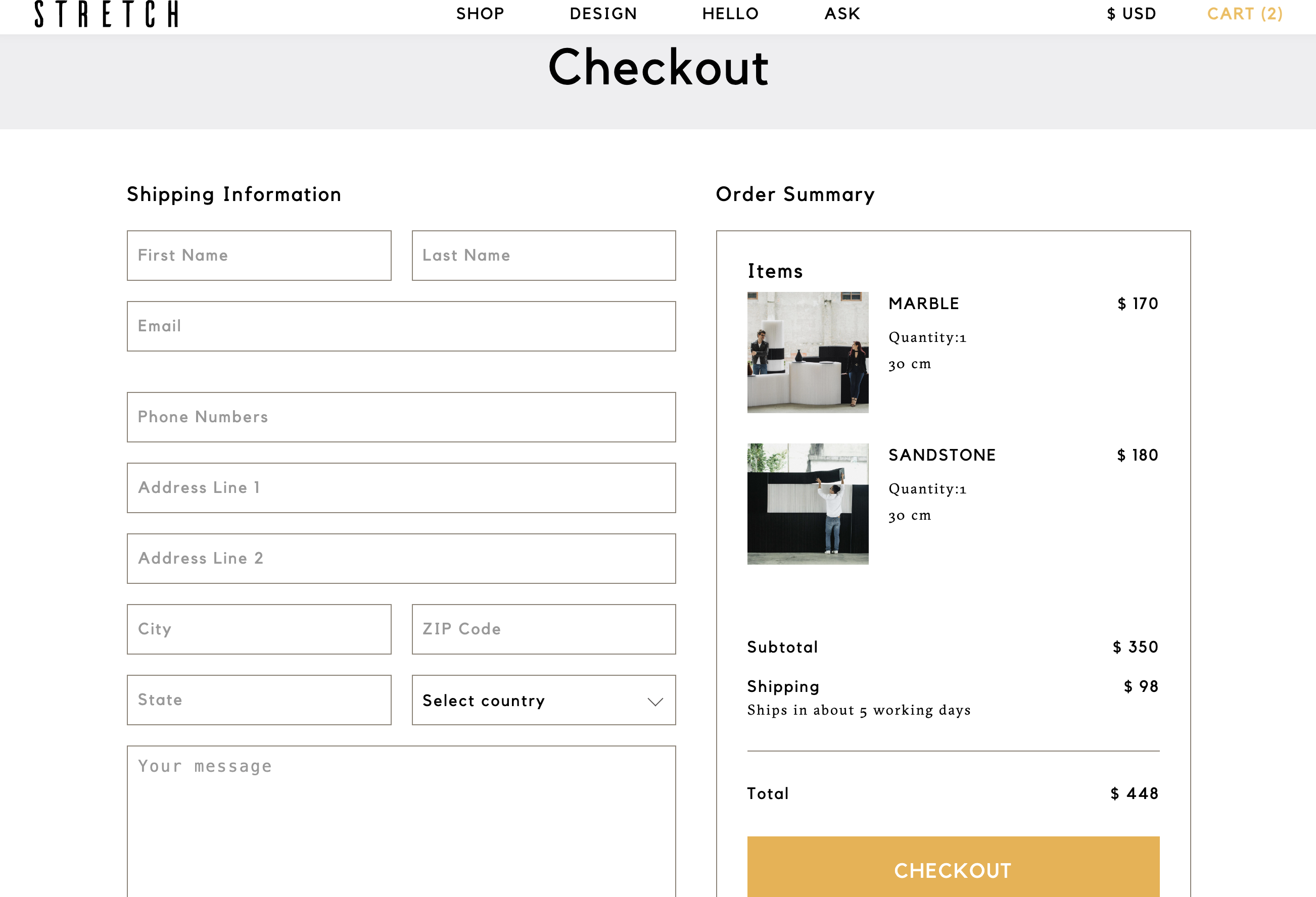
For shipping anxiety: we moved shipping information upfront to display at the product page and cart stages, letting consumers know the full cost before making a decision. The checkout page was also redesigned from a top-bottom split to a dual-column layout, making the order summary and form visible simultaneously — no more scrolling to confirm what you're buying.
For language barriers: we replaced lengthy text with visual feature icons (icon + short title), using visual language to bridge language differences, making core product features instantly understandable.
Outcome
The redesigned e-commerce platform showed significant improvements in navigation clarity, checkout flow smoothness, and product page information readability. Repetitive customer service inquiries about shipping and materials also decreased significantly — meaning the design successfully absorbed consumer concerns that previously required manual responses.
Can a paper honeycomb chair earn the trust of global consumers and get them to buy? The answer lies in every design decision.